Australian Sapphire Melee
Melee are small cut gems up to around 5mm. The gems generally come in lots or parcels graded by size, shape and colour.
Size
With sizing there is usually a small +/- tolerance allowed around the stated size, so if for example a parcel is graded 3.5mm there might be a deviation of sizes like 3.4, 3.45, 3.52, 3.6mm. They are not all going to be exactly 3.50mm but they will be within a certain tolerance.
Colour
Grading the colour of Australian sapphire is a significant challenge especially when it comes to lots of small tiny gems. It is very much a spectrum with the primary hues being yellow, green and blue. There are fancy colours, like orange but these you don’t generally see much as melee. Australian sapphires are also quite likely to be parti-colours. This means that to a greater or lesser degree there will be zones or patches of two or more colours such as yellow and green, or yellow and blue within a gem. The size of each colour zone, it’s placement within the gem particularly in respect to the culet, the saturation of the hues, shape and other considerations are factors which make colours and how a sapphire will “face up” so subtly variable and tricky to assess. They are each as individual as a person’s fingerprint.
Further complicating colour is the crosstable property of sapphire crystals. Looking down the crystal from the top (down the c-axis) you might see blue but when you look across the crystal from the side you might see green. This means the sapphire is blue with a green crosstable, or blue-on-green. How the crystal is orientated when cutting the gem will affect the amount of blue or green hue that appears to the eye and one will usually be dominant over the other becoming the primary hue and the other secondary.
When it comes to describing colour I normally use secondary-primary format. For example, when I look directly down at the table of a sapphire gem my first impression might be blue and I flag that as being the primary colour. As I move the gem around I might see a green secondary colour there as well and together I’d call that sapphire greenish-blue, or simply green blue. If it becomes too difficult to pin down then I might just call it a parti colour, particularly in the case of yellow and blue zoned sapphires because here you will often get the colour mixing effect, ie. mix some yellow paint with blue and what colour will you get? Green. This colour magic is what makes Australia sapphires so special and amazing and unlike any other sapphire in the world.
The basic set of colour hues I use most are:
Yellow - Green Yellow - Yellow Green - Green - Blue Green - Green Blue - Blue
Matching Colours - Birds of a Feather
Matching colours is a time-consuming, imperfect exercise. For the reasons explained above, every gem is unique and will be subtly different from it’s neighbour. Even though I might think that particular parcel of 50 small 4mm round sapphires are all green blue, trying to get a perfectly matched pair might not be as easy as you think. There will be darker saturated ones, lighter ones, ones that are a bit more greenish and others more bluish, all along a spectrum of something called green blue. Often there will be some overlap between different lots of similar hues. When does green blue become blue green? When does the eye start to think, yup, that gem is a little bit more green then blue but it’s very close. So yes, you might find some green blue stones in a parcel of blue and vise versa.
Therefore, when I grade sapphires I try to get them as close together in hue, within a certain spectral tolerance. Like the saying goes, birds of a feather flock together. When selecting stones for an order I will normally do a standard “of a feather” match. Please keep in mind that it is just myself doing everything so I need to be conscious of time-vs-economics when it comes to melee. If you want a more precise colour match then a service fee may be charged at my discretion. I also might not have the quantity on hand to select from to fill an order for a very particular colour. So some flexibility may be required.
Keep in mind that it is virtually impossible to accurately match melee with photos of a given sapphire. If you are wanting me to match a pair of melee gems with your sapphire ring for example, it is best done with the ring in hand. Working from a smartphone camera photo of the ring in poor light is not going to work.
Example Colour Grading
The following is to provide an example of how a particular lot of Australian sapphire melee gems appear and photograph under the various conditions and setups (lighting, backgrounds, cameras, etc) that I will likely use. I try to photograph the sapphires under these conditions in a consistent manner so that parcels can be compared to each other as required.
Please keep in mind that photos of gems are just that, photos. The gems never look as good as they do in the hand and try as I might it is very hard to really represent colours as accurately as I’d like. Photographing gemstones especially Australian sapphires with their parti colours can drive one crazy. A certain amount of common sense and imagination can aid visualising what the gem in the photo will look like in the hand. This becomes easier the more you see and handle sapphires however my hope is that by photographing a parcel under several different conditions as I have done here, this will help you to average out the colours across different photos and parcels and have a good idea what they might actually look like.
The parcel comprises ten Australian Sapphire 5mm round melee gems. The colours are a graded run from green yellow, yellow green, green, blue green, green blue and blue. With green being at six o’clock and blue at twelve. The lighter green yellow stone happens to be on the immediate left of the green stone.
Of particular interest there are two photos of the melee gems table down (upside-down) on a backlit LED pad. What I like about these is that they show the parti colour zones and saturations quite well. They might not necessarily indicate how the colours mix and present when viewed correct way up but they do show zoning and saturation in a way that is useful. If you look closely you can see how each and every sapphire is a little bit different.

Photographed in gem case, Canon camera

Table down on backlit LED pad - WHITE, Samsung phone camera

Table down on backlit LED pad - GRAY, Samsung phone camera
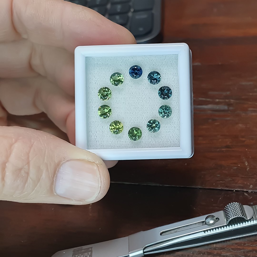
Lit by LED pad, Samsung phone camera

Lit by LED pad, Samsung phone camera
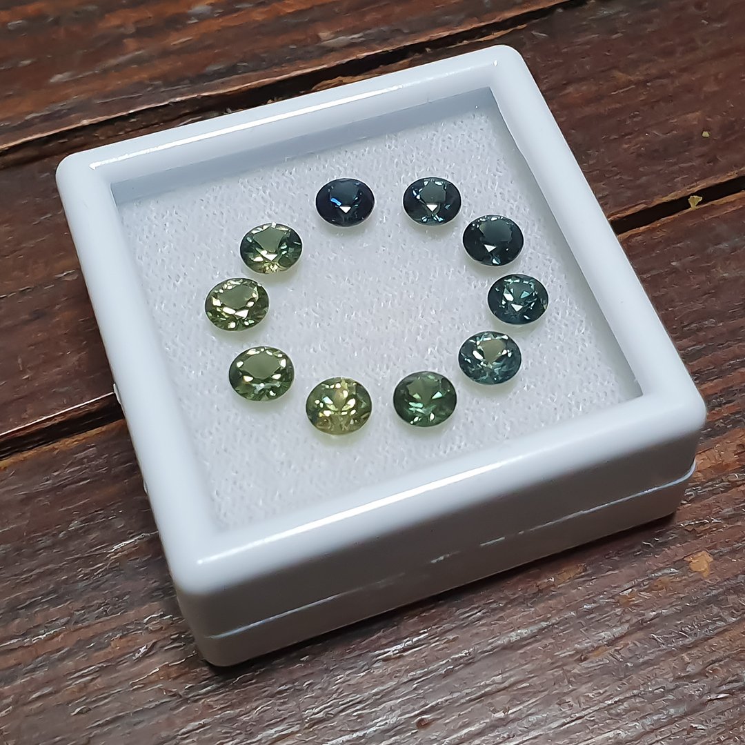
Lit by LED pad, Samsung phone camera
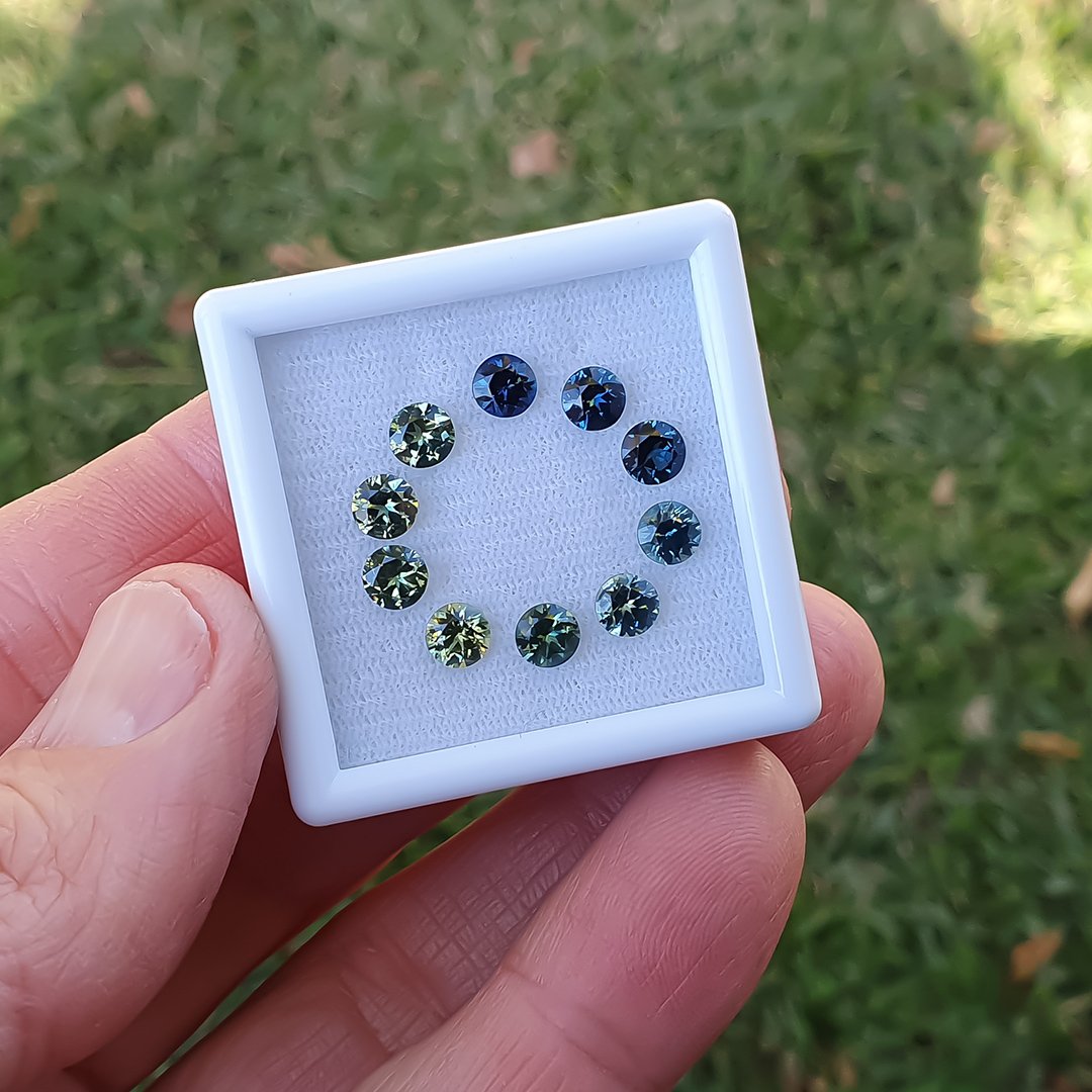
Outdoor shade, Samsung phone camera
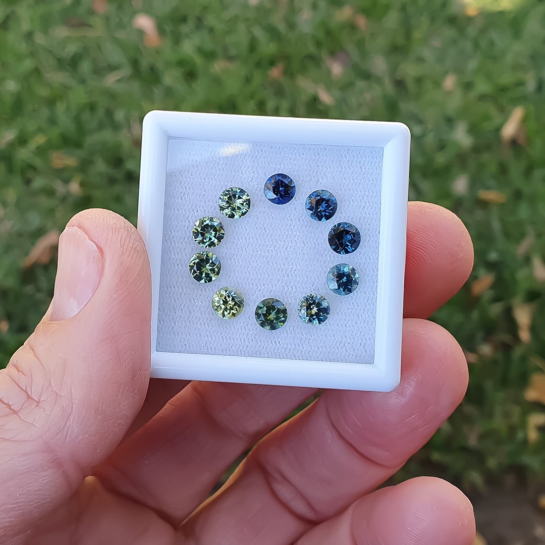
Outdoor shade, Samsung phone camera
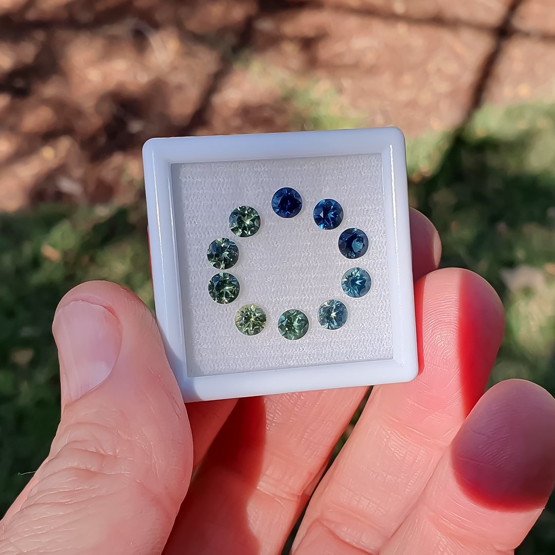
Outdoor shade, Samsung phone camera

